


Zest Design System
How we reduced 75% maintenance work, empowered multi-brand and multi-platform, and achieved 91% adoption
Consumer Design System
The Team
The HelloFresh Design Systems team is called Zest. We're a team of 11, set in a Squad model and formed by:
- 1 Squad Lead, 1 Design Lead, 1 Product Owner
- 2 Product Designers (Myself and a mid-designer)
- 6 Engineers: 2 iOS, 2 Android and 2 Front End

My Role
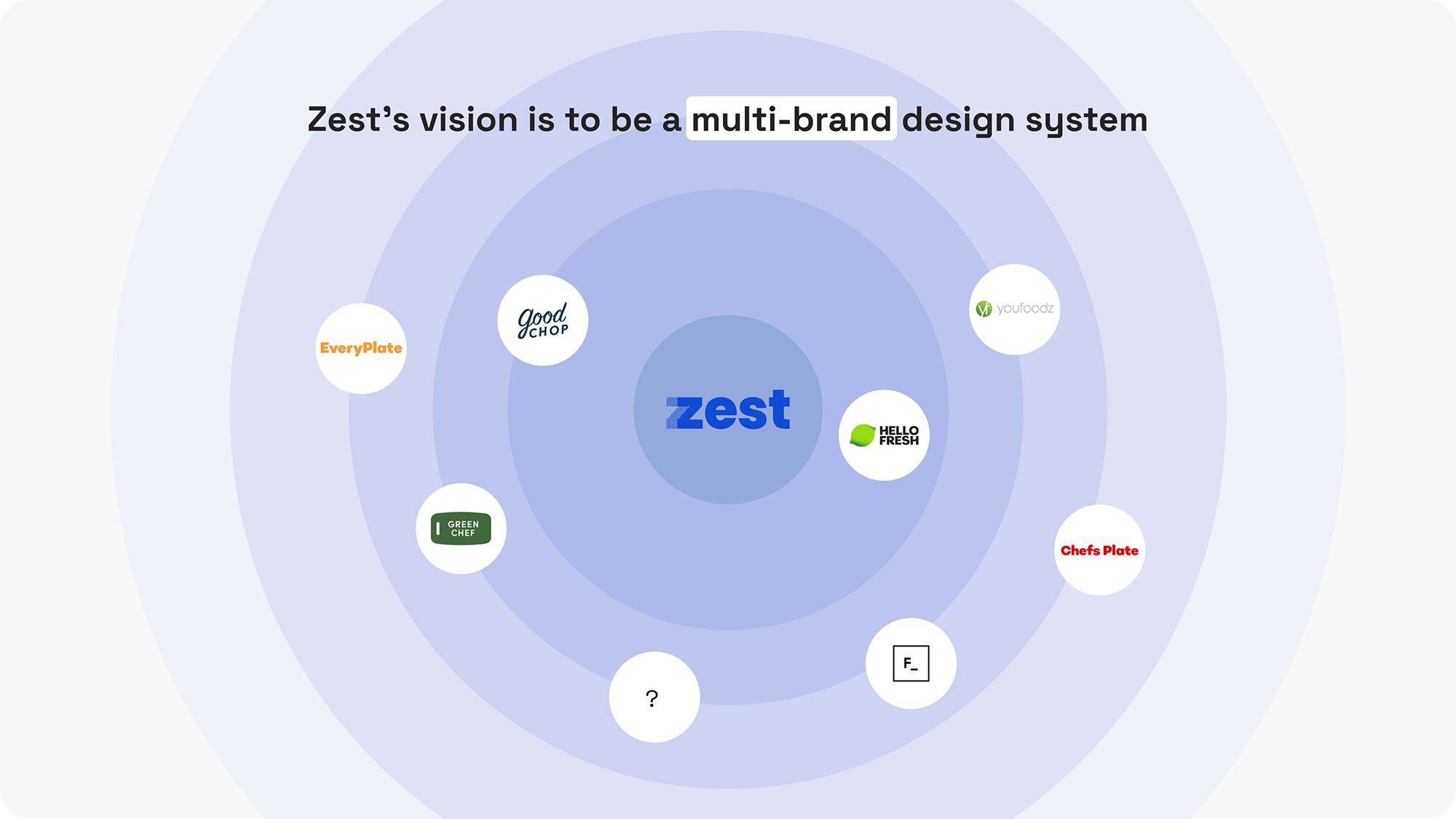
As the Senior Designer at HelloFresh, I led the New Token Architecture initiative to enhance the scalability and accessibility of our new design system, Zest. Our previous system lacked customization options for our nine brands. By gathering requirements, soliciting feedback, and aligning with internal stakeholders, I ensured Zest met our diverse needs.
Through collaborative efforts, we transformed four separate systems into one cohesive design system supporting nine brands across three platforms. I'm proud of our team's work in creating a robust, flexible system that sets a new standard for design at HelloFresh.
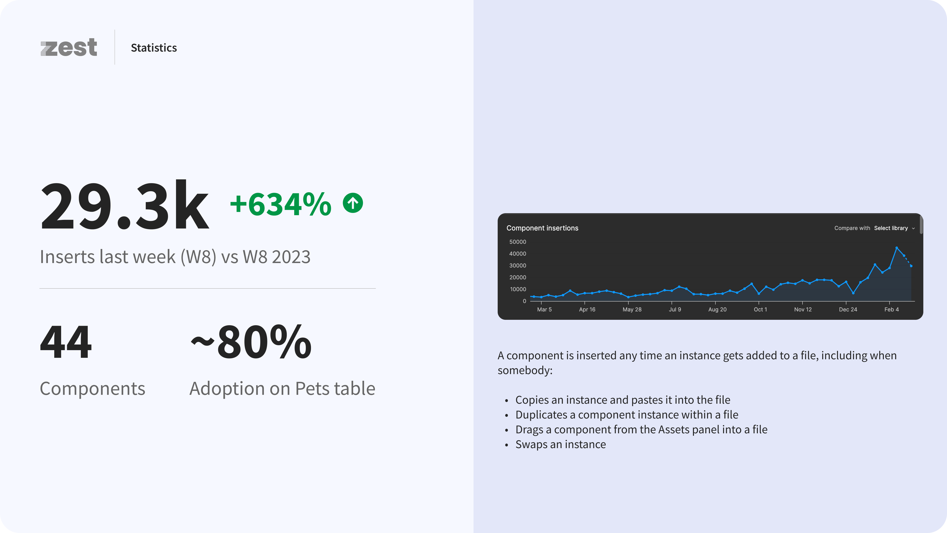
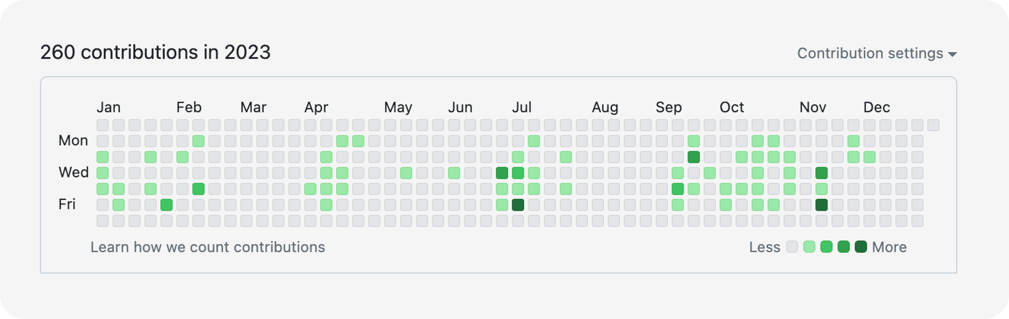
In 2023 alone, I made 260 contributions - an average of 1 contribution per day - to our Zest Tokens GitHub repository.
The Problem
At the beginning of last year, there were two design systems and six libraries to support eight brands. This caused the following issues:
- Lack of a single source of truth
- Redundant maintenance
- Inefficiency of development process
- Not optimized for enabling our multi-brand teams
The Solution
New Tokens Architecture
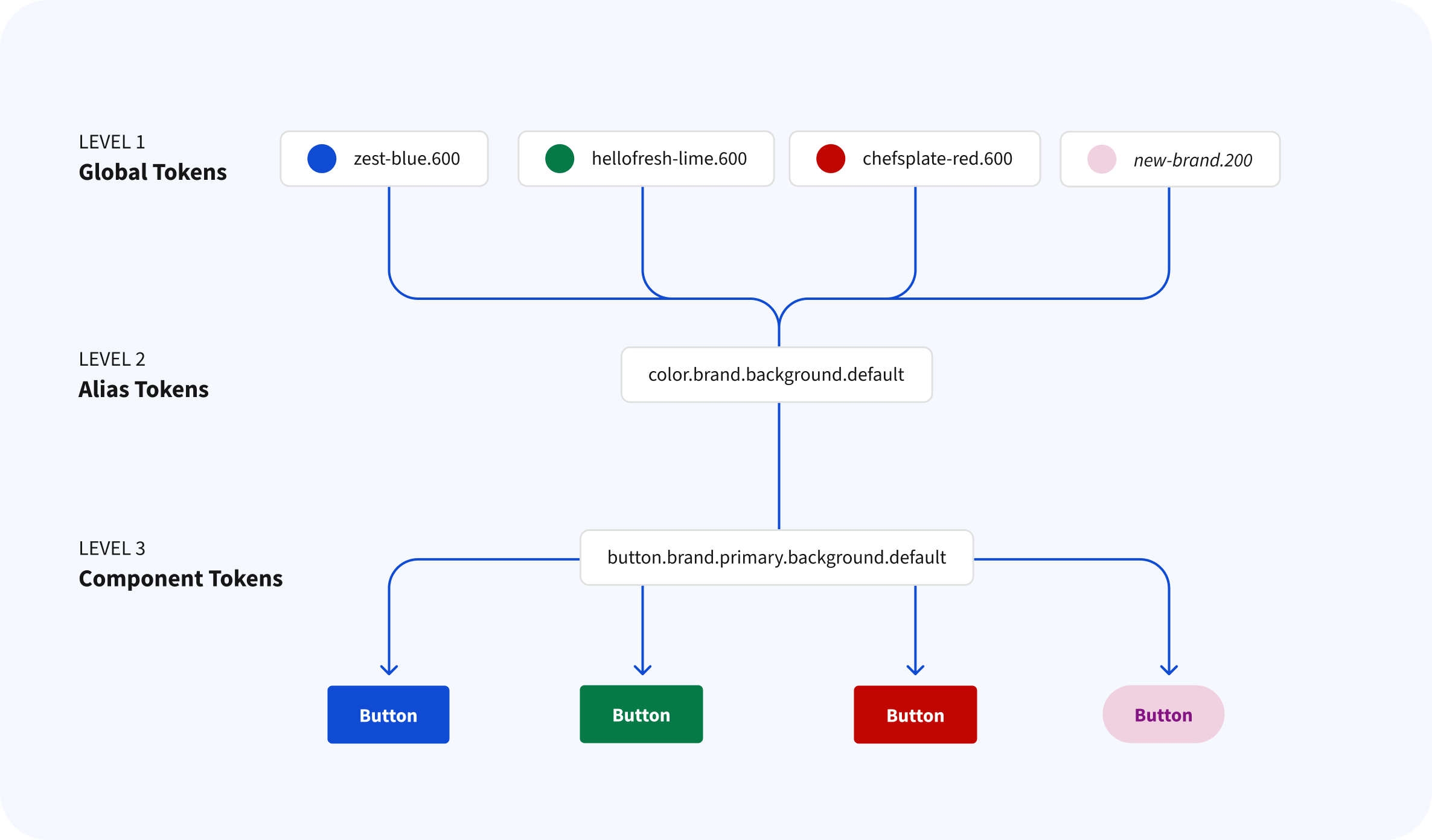
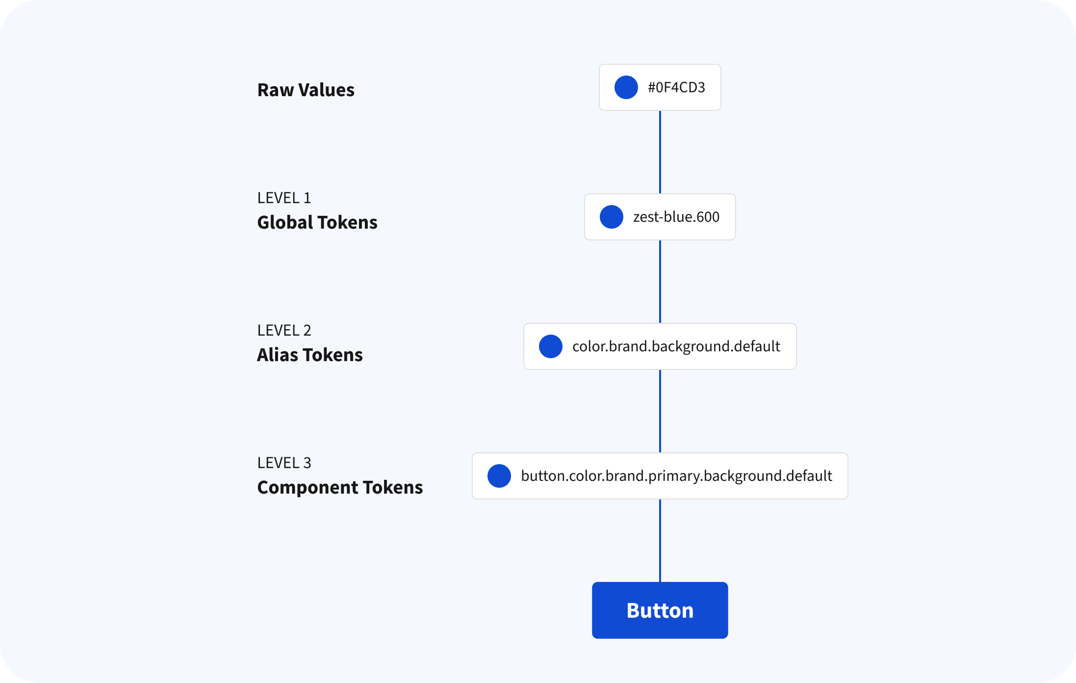
Our new design tokens follow a 3 tier model based on whether the token stores an option or a decision. Each tier is referenced by the one above it (referred to as aliasing).
We organize our components in 3 levels: Global, Alias and Component tokens.

Here's an overview of them:
| Token type | Description |
| Global tokens | Global tokens can either be directly used or referenced by other token types (alias or component-specific tokens) within a design system. |
| Alias Tokens | Alias tokens are context-specific and reference global tokens. Alias tokens are also known as semantic tokens |
| Component Tokens | Component-specific tokens explicitly store and represent unique and specific design decisions associated with a particular component. |
How To Consume The New Tokens
This is an example of how a token is consumed in a cascading fashion. Component tokens refer to alias tokens, and alias tokens refer to global tokens. With this new structure, shipping new brands has become significantly easier and more efficient, allowing for swift customization and seamless integration within our unified design system.
Seamless Multi-Brand Integration
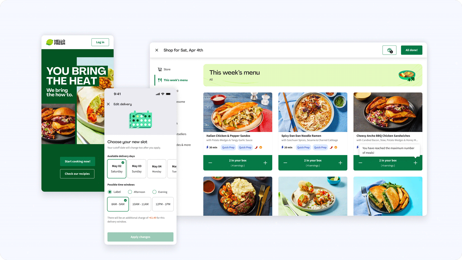
The game changer: now designers are able to utilize variable mode to switch between brands.
We have optimized multi-brand support with variable mode. The variable mode is integrated into designers’ workflow, enabling them to manage the same screen for multiple brands simultaneously.
That was a business requirement and part of the company KR's from last year, having in my that many product teams work for multi-brands at the same time.
Automated Tokens Workflow
By using a combination of Figma Tokens Studio and Figma Variables, we created an automated way of exporting tokens directly from Figma into our GitHub repo. This is how we did it:
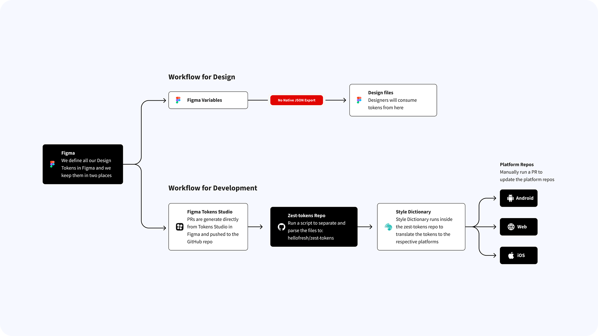
This approach of creating a streaming-lined solution, where Design owns the design tokens and pushes the changes directly to GitHub, cuts a lot of rework for each one of the platforms Zest supports (iOS, Android, and Web) and helps to reduce work redundancies and avoid inconsistencies between platforms, which were the major issue of the old system.
The Challenge
Our challenge was to consolidate them all and make Zest the one and only design system. Here’s how I lead the team through the process:
- Map out components in all six libraries
- Get buy-ins from product teams leadership and design leadership
- Involve stakeholders throughout the process
To achieve the goal, I mapped out all the components available in all six libraries. To set the team up for success, the team and I made sure we got buy-in from product teams leadership and design leadership and that everyone was aware of the vision the company shared: Having one design system for all brands would reduce time in development and make sure we would promote design excellence and standards for all brands at the same time.
My most important role was to rework the whole token architecture we had, to enable the multi-brand and multi-platform support.
At that point, our many libraries had a very simple one-level token structure that didn't allow us enough flexibility when customizing components and adding brand characteristics into the digital products.
The Process

- Discovery and Research: The project began with discovery and research, examining references from other design systems and solutions used by companies with mature design systems.
- Token Architecture Proposal: After validating our research, I mapped out components and proposed a token naming structure, which was approved by design and development teams.
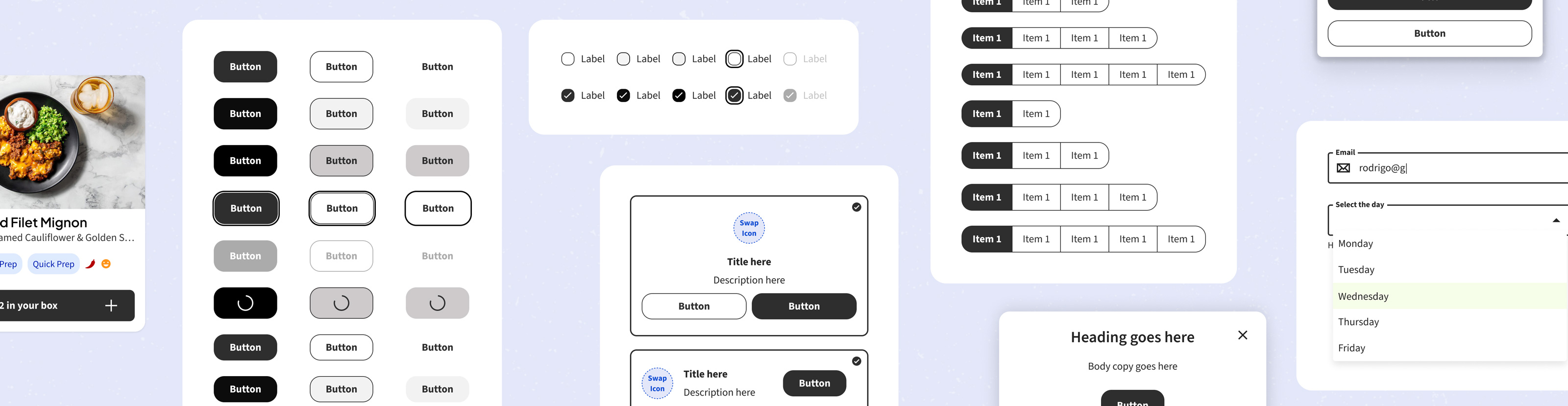
- Proof of Concept: I created a staging library to test 10 components and apply the new tokens to them. This allows us to understand how the component would behave and how designers using the component would perceive them.
- User Feedback: We conducted user interviews with product designers in Figma, gathering valuable feedback that confirmed the success of our experiment.
- Implementation: Validated tokens were implemented in the main design library, starting with the initial 10 components.
- Tokens application: We applied tokens in five waves, each focusing on a small number of components to ensure accuracy and validation.
The Results
The result is that now we have a design system that can accommodate all nine brands in an optimized and frictionless way. Eliminating component redundancies and finally having a single source of truth for all brands. We saw a whopping increase of 634% of Zest's component usage after we launched the New Tokens Architecture when compared to the same week of 2023.